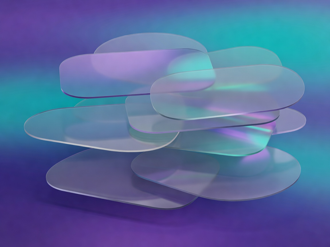
Guide 01
Liquid Glass & Futuristic 3D
Translucent surfaces, blur, rim light and depth. The most expensive family to get right — and the easiest to ruin with poor contrast.
- backdrop-filter
- radius 22–24px
- dark ground
UIAtlas · website UI style library
Ten named UI styles, each with a typography suggestion, card architecture, button and navigation pattern, radius scale, elevation model and motion rule. Preview the same dashboard component in every style, then copy the specification straight into your project README.
One component. Ten design languages. Switch a style and the same markup changes surface, radius, elevation, type and motion — currently showing Liquid Glass.
Dashboard module
Build 4.2.0 is live on every regional edge. Response times stayed inside the target window during rollout.
style: liquid-glass
typography: Inter / SF Pro — 600 headings, 400 body
radius: 24px cards, 999px pills
border: 1px rgba(255,255,255,0.35)
surface: rgba(255,255,255,0.14) + blur(14px) saturate(140%)
elevation: 0 18px 40px rgba(10,15,40,0.45)
buttons: translucent pill, light hairline border
nav: floating blurred pill bar, 16px inset
motion: 220ms ease-out, 8px rise on enter
cards: stacked media + body, full-bleed top image
best-for: SaaS dashboards, AI tools, device pages
style: neo-brutalist
typography: Archivo / Space Grotesk — 900 headings, uppercase
radius: 0px everywhere
border: 3px solid #111111
surface: flat #FFFFFF on a vivid ground
elevation: 8px 8px 0 #111111 (hard offset, no blur)
buttons: rectangular, hard shadow, 2px press travel
nav: exposed inline bar with a thick bottom rule
motion: 120ms step transforms, no easing softness
cards: framed canvas — offset block behind the panel
best-for: dev tools, music, streetwear, studios
style: soft-minimal
typography: Inter — 600 headings, 400 body, 1.65 line-height
radius: 18px cards, 12px controls
border: 1px solid #E4E9EF
surface: #FFFFFF on #F4F6F9
elevation: 0 6px 18px rgba(30,45,70,0.08)
buttons: filled 12px radius, single accent hue
nav: light bar, medium weight links, underline on hover
motion: 180ms ease, opacity plus 4px travel
cards: stacked, generous 24px internal padding
best-for: fintech, health, onboarding, B2B forms
style: editorial-luxury
typography: serif display + grotesque body, tracked eyebrows
radius: 2px
border: 1px solid #C8BFAE hairline rules
surface: warm paper #FFFDF8 on #F3EFE7
elevation: none — separation by rules and whitespace
buttons: text button with a 1px underline, or ink block
nav: wide-tracked uppercase links, centred wordmark
motion: 400ms fade, no movement on scroll
cards: image over caption, wide margins, drop caps
best-for: fashion, hospitality, publishing, property
style: organic-modern
typography: humanist sans, 1.7 line-height, soft caps
radius: 26px, asymmetric on media blocks
border: 1px solid rgba(40,60,30,0.12)
surface: #FBFAF4 on a muted green ground
elevation: 0 10px 24px rgba(40,60,30,0.10)
buttons: pill, earth-tone fill, 44px min height
nav: rounded inline bar, leaf-shaped active marker
motion: 300ms cubic-bezier(0.22,1,0.36,1)
cards: blob media mask, text-first body
best-for: wellness, food, sustainability, travel
style: cyber-industrial
typography: IBM Plex Mono labels, condensed sans headings
radius: 4px
border: 1px solid #2A323B, 1px accent hairlines
surface: #15191E on #0D0F12
elevation: glow ring 0 0 0 1px rgba(200,255,46,0.18)
buttons: square, accent outline, mono uppercase label
nav: left rail with numeric indices and status dots
motion: 90ms snap, scanline or cursor blink accents
cards: data grid header with monospaced metrics
best-for: infrastructure, security, gaming, crypto
style: bento-fusion
typography: geometric sans, 700 headings, tight tracking
radius: 20px on every tile
border: 1px solid #E1DDF2
surface: #FFFFFF tiles on #F0EEF8
elevation: 0 4px 0 #E1DDF2 (solid lower edge)
buttons: rounded rect, violet fill, 16px radius
nav: pill group, active tile inverted
motion: 200ms scale(1.02) on tile hover
cards: unequal tile grid, 1x1 / 2x1 / 2x2 spans
best-for: product marketing, mobile apps, portfolios
style: futuristic-3d
typography: wide geometric sans, 500 headings, light body
radius: 22px
border: 1px solid rgba(255,255,255,0.14)
surface: layered gradient panels on near-black
elevation: 0 24px 50px rgba(0,0,0,0.6) + inner top light
buttons: gradient fill, inner highlight, pill radius
nav: floating dark capsule with a glow active state
motion: 500ms parallax and perspective tilt
cards: raised panel with rim light and depth stack
best-for: hardware, 3D tooling, launch pages, XR
style: swiss-grid
typography: Helvetica / Inter — tight tracking, huge H1
radius: 0px
border: 1px solid #000000 rules only
surface: pure #FFFFFF, one red accent
elevation: none — hierarchy from scale and position
buttons: square, black fill or 1px outline
nav: flush-left labels on a 12-column baseline grid
motion: none, or 150ms opacity only
cards: strict column blocks, caption under media
best-for: architecture, consulting, museums, legal
style: sculptural-ui
typography: soft geometric sans, 600 headings, calm sizes
radius: 30px
border: 1px solid rgba(0,0,0,0.05)
surface: single clay tone, cards share the background
elevation: 12px 12px 24px dark + -10px -10px 22px light
buttons: extruded pill, pressed inset on active
nav: recessed track with a raised active pill
motion: 260ms ease-in-out, depth swap on press
cards: moulded panel, no colour separation from ground
best-for: audio apps, smart home, kids, calm tools
Every field maps to a CSS custom property in the guides. Paste the block into your design tokens file and replace the placeholder values as you build.
Each guide pairs two related styles, breaks down their card architecture and component rules, and lists the trade-offs you will hit in production.
Guide 01
Translucent surfaces, blur, rim light and depth. The most expensive family to get right — and the easiest to ruin with poor contrast.
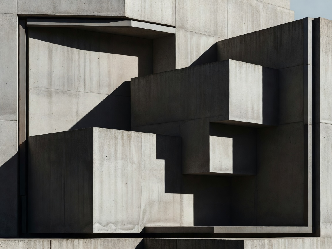
Guide 02
Raw structure, exposed borders, monospaced labels and zero blur. Fast to build, loud by default, and unforgiving of weak copy.
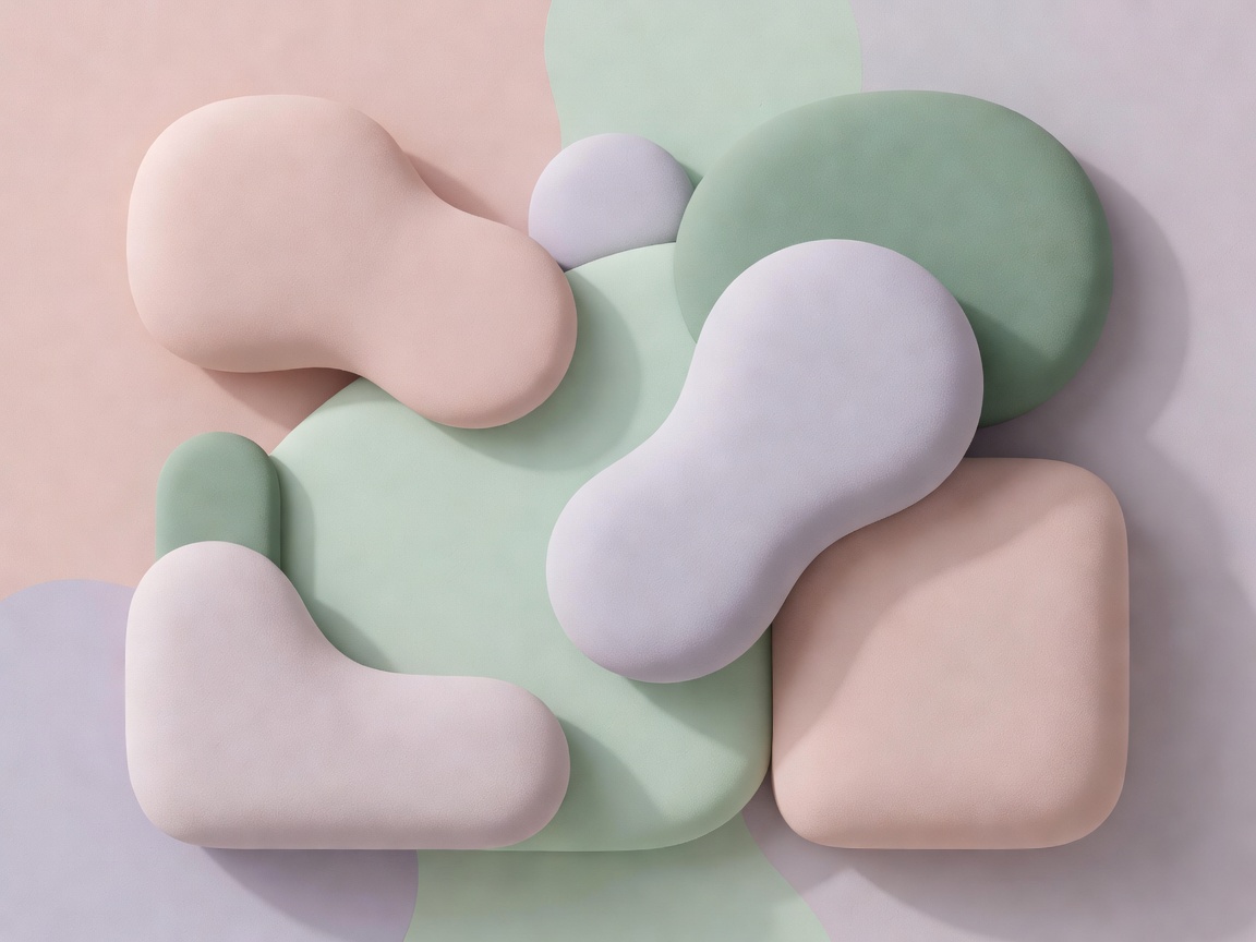
Guide 03
Calm surfaces, one accent hue, generous line-height. The safest default for forms, onboarding and anything regulated.
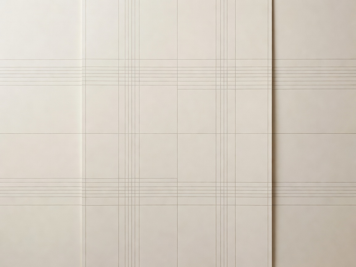
Guide 04
Typography does the work. No shadows, no gloss — just scale, rules, whitespace and a disciplined twelve-column baseline.
Guide 05
Tile grids and moulded surfaces. Excellent for feature pages, risky for dense data and for anything that needs crisp focus rings.
A style decision is a constraint decision. Work through these four questions before you open a design file, and the rest of the build stops arguing with itself.
Dashboards, tables and long forms punish decorative surfaces. If a single screen carries more than about twelve data points, start in the Soft Minimal or Swiss Grid families and add personality in the marketing pages instead.
Translucent and neumorphic surfaces reduce the contrast between text and background. If you need to meet the WCAG 2.2 contrast criteria comfortably, choose a style with opaque panels — or commit to a fixed scrim behind every blurred panel.
Neo-Brutalist and Swiss Grid are mostly borders, spacing and type scale, so a small team can keep them consistent. Futuristic 3D and Sculptural UI need someone who will own gradients, light direction and shadow pairs for the life of the product.
Copy the specification from the style lab into a tokens file: radius scale, elevation pair, border width, type scale ratio, motion duration. Once those five values are fixed, component work becomes assembly rather than negotiation.
For the mechanics behind the glass family, read the MDN documentation for backdrop-filter. For contrast and focus requirements, use the W3C WCAG 2.2 quick reference. Our guides describe style patterns; those two sources define what the browser and the standard actually require.
Need a second opinion on a direction before you commit? Send us the brief and we will reply with the two styles we would shortlist and why.